A showroom rarely functions as a cultural destination. Bentley Exhibitions transforms the showroom into a platform for contemporary Georgian art, where artistic practice and automotive craftsmanship coexist through a flexible curatorial framework.
The identity begins with a graphic language derived from Bentley's iconic wings. Reinterpreted as an adaptable visual element, it establishes a connection between the brand and each artist's work.
The visual system extends across digital campaigns, motion, and environmental applications. Each exhibition develops its own identity while remaining connected to the broader programme.
The exhibition experience begins before visitors enter the showroom. Digital invitations introduce each artist's visual language and create a seamless transition from first encounter to physical space.
Every exhibition develops a complete sensory identity. Graphics, sound, catering, and spatial details all respond to the participating artist's work, creating an environment where every element belongs to the same curatorial narrative.
A flexible identity system evolves with every chapter of the programme. Typography, colour, and composition respond to each artist's practice, creating distinct visual identities within a coherent framework.
Artist-led collectibles become part of the show itself. Developed in collaboration with each artist, they preserve the exhibition's visual language in objects that continue the experience beyond the showroom.
Designed as an evolving program rather than a series of isolated displays, Bentley Exhibitions establishes a lasting platform where contemporary art, architecture, and brand identity develop through ongoing collaboration.
*Client* / Bentley Centre Tbilisi / *Concept & Creative Direction* / Teona Kokhodze / *Curatorial Team* / Teona Kokhodze / Sopio Kolkhidashvili / Ilana Slutsky / Nina Bakhtadze / *Visual Identity & Graphic Design* / Teona Kokhodze / Tamuna Kontridze / *Motion Design* / Davit Matchavariani / Verse / *Production Coordination* / Veko Bakashvili / *Special Thanks* / Corridor Space / Kera Gallery / Dédicace Gallery / LC Queisser / All Participating Artists
Bentley Exhibitions
Cultural Platform
Spatial Narrative
01


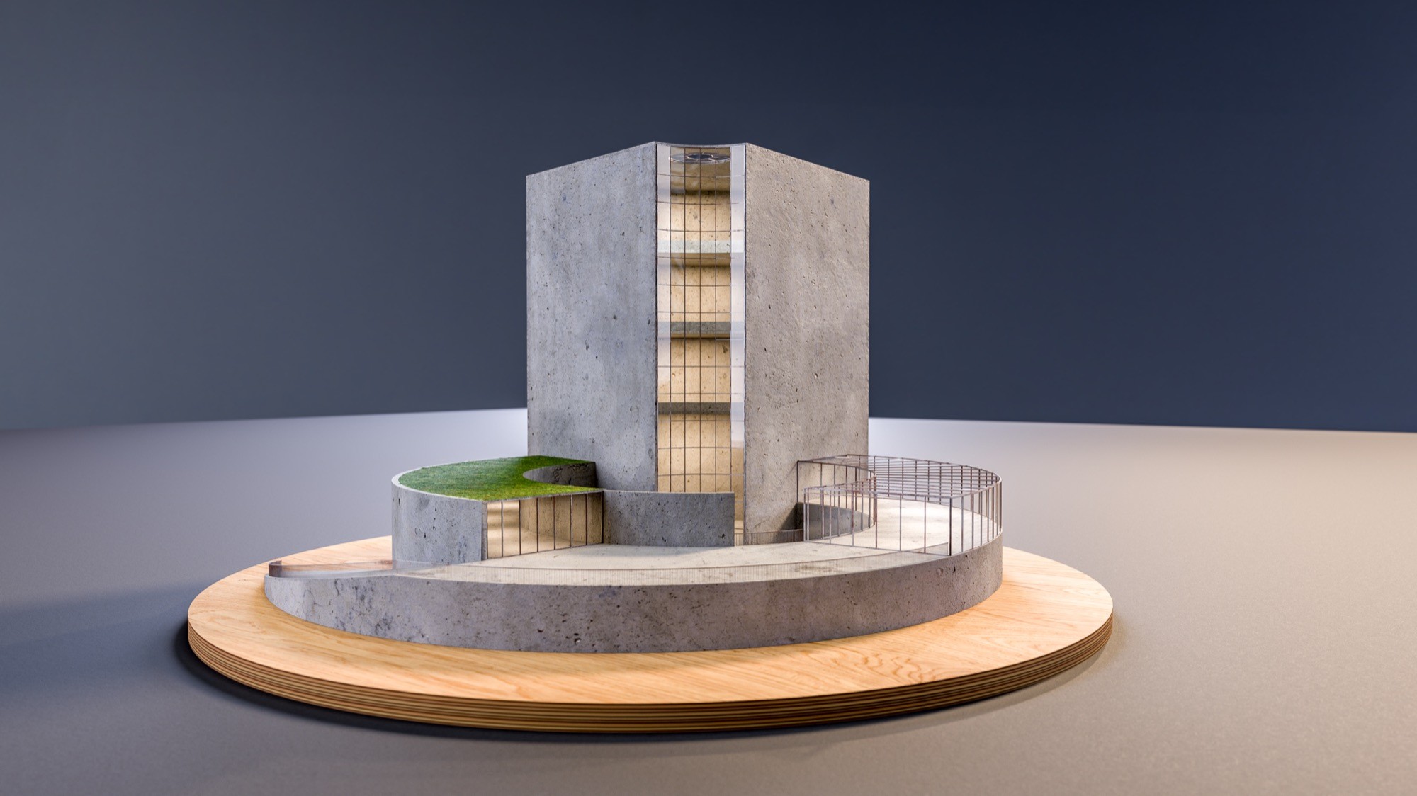
Museum of Georgian Script is a conceptual cultural institution dedicated to the evolution of Georgian writing. Architecture, exhibition design, identity, and wayfinding come together to transform the history of the script into a spatial experience.
The architecture begins with the earliest Georgian script, Asomtavruli. Its circles, semicircles, and straight lines are translated into the geometry of the building, giving the museum a form intrinsically connected to its subject.
A central void connects the museum vertically, allowing the history of Georgian writing to unfold across three levels. Natural light enters through a circular opening above, turning the atrium into the spatial centre of the experience.
The museum’s identity is built from the same geometric principles as its architecture. Circles, semicircles, and straight lines reference the structure of Asomtavruli, forming a contemporary symbol rooted in the earliest Georgian script.
The communication system builds on the museum's graphic language. Typography, geometry, colour, and archival imagery establish a consistent visual framework across every touchpoint.
The identity adapts across exhibitions, workshops, and public programmes. A modular graphic framework gives each event a distinct expression while maintaining a recognisable institutional language.
A colour-coded wayfinding system translates the museum’s programme into clear visual information. Symbols, typography, floor numbers, and colour work together to guide visitors through exhibitions and public facilities.
Each exhibition level represents a stage in the development of Georgian writing: Mkhedruli, Nuskhuri, and Asomtavruli. Visitors move upward through the building, travelling backwards through the history of the script.
The museum experience encompasses both digital and physical touchpoints. Information about exhibitions, interactive media, audio guides, and navigation tools enhance the visitor's journey beyond the museum building itself. Together, these elements create a cohesive narrative in which architecture serves as a medium for preserving and communicating cultural heritage.
*Concept & Creative Direction* / Teona Kokhodze / *Spatial Visualisations* / Paralel Studio / *Production* / Fourth Wall / *Motion Graphics* / Malkhaz Tchubabria / *Recognition* / *Best Project in Visual Communication Design* / BTK University of Art & Design, Berlin
Museum of Georgian Script
Museum, Cultural
Identity, Exhibition
02



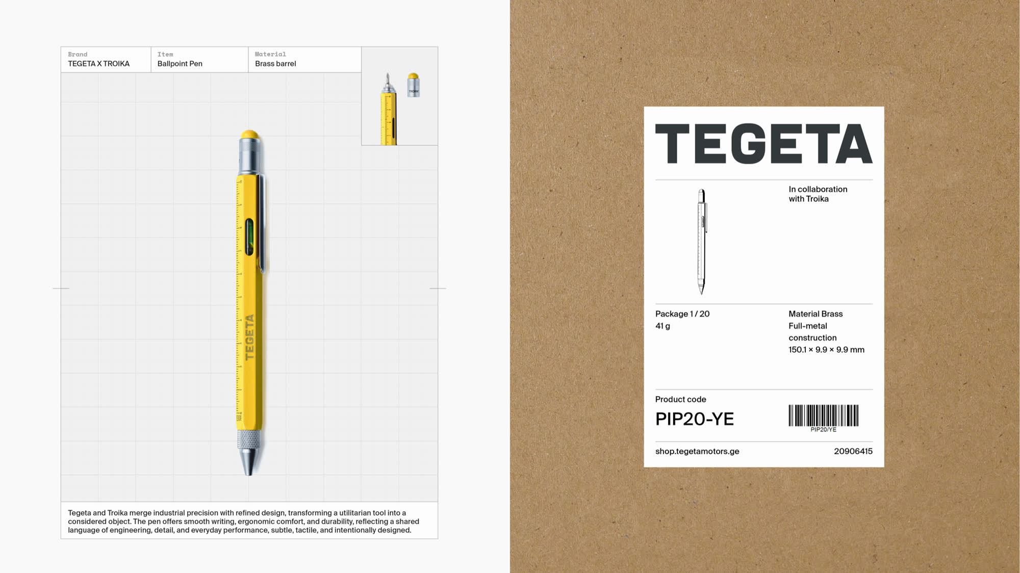
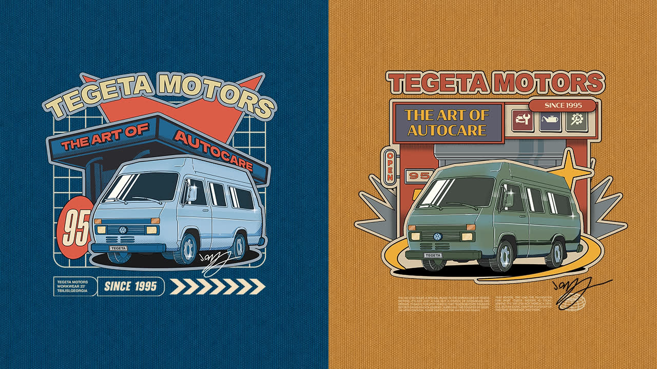
This Is Not Merch transforms automotive culture into a collection of wearable objects, graphic systems, and collectible pieces. Developed for Tegeta Holding in collaboration with artists, designers, and established brands, the project extends beyond conventional merchandise to encompass fashion, community, and cultural expression.
Selected in collaboration with Troika, existing objects were carefully curated for their material quality, functionality, and compatibility with the project's visual language. Through branding, packaging, and graphic application, they became part of a cohesive collectible system.
The project operates as a complete visual system rather than a series of isolated products. Editorial design, packaging, labels, and physical details establish a shared language across every collaboration.
Material research connects automotive utility with clothing design. Workwear fabrics, industrial colour references, and tactile finishes provide the foundation for a collection designed for everyday use.
Workwear becomes a form of identity. Familiar functional details are refined through proportion, typography, construction, and personal elements that create a stronger relationship between the garment and its wearer.
The illustrated graphics draw from Tegeta's heritage, transforming historical references and automotive iconography into a visual language that connects past and present.
The flexible system also extends to automotive brand collaborations. Each edition develops its own visual character while remaining connected to the broader visual language of the project.
The collection becomes a cultural extension of Tegeta, expanding the brand beyond the automotive environment. Across apparel, objects, graphics, and collaborations, its identity is translated into something people can wear, use, collect, and make their own.
*Client* / Tegeta Holding / *Concept & Creative Direction* / Teona Kokhodze / *Illustration* / Giorgi Karsimashvili / Ninveli / Aleksandre Vartapetovi / Tamuna Kontridze / *Motion Design* / Luka Todua / Davit Matchavariani / *Collaborating Brands* / More is Love / Casio / Troika / Strauss / Reckless /
This Is Not Merch
Collectibles
Lifestyle Branding
03





Time rarely announces itself. It accumulates quietly, layer by layer. Thirty Years in Form gives that process physical form, translating three decades of dedication into a unified architectural object.
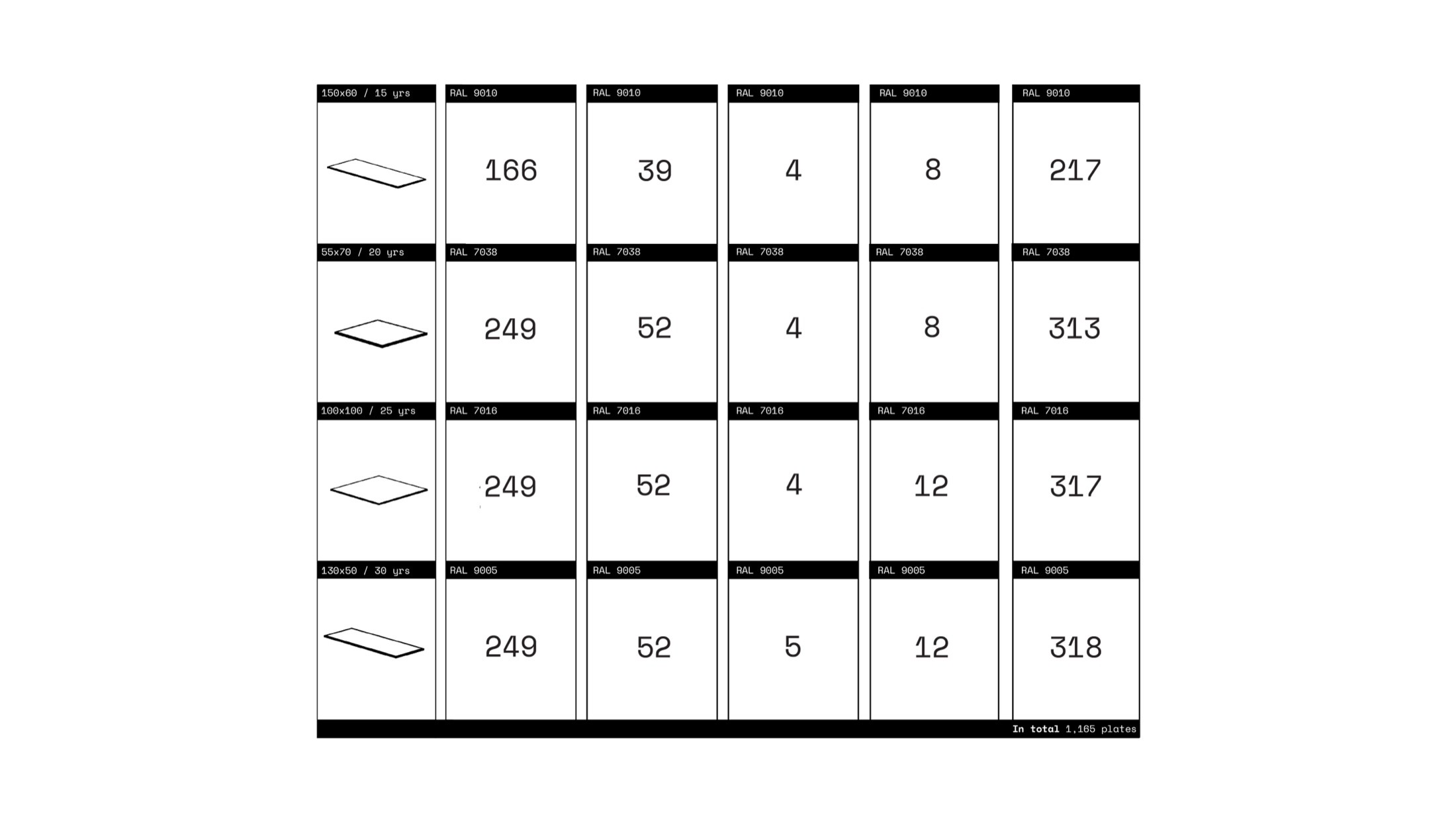
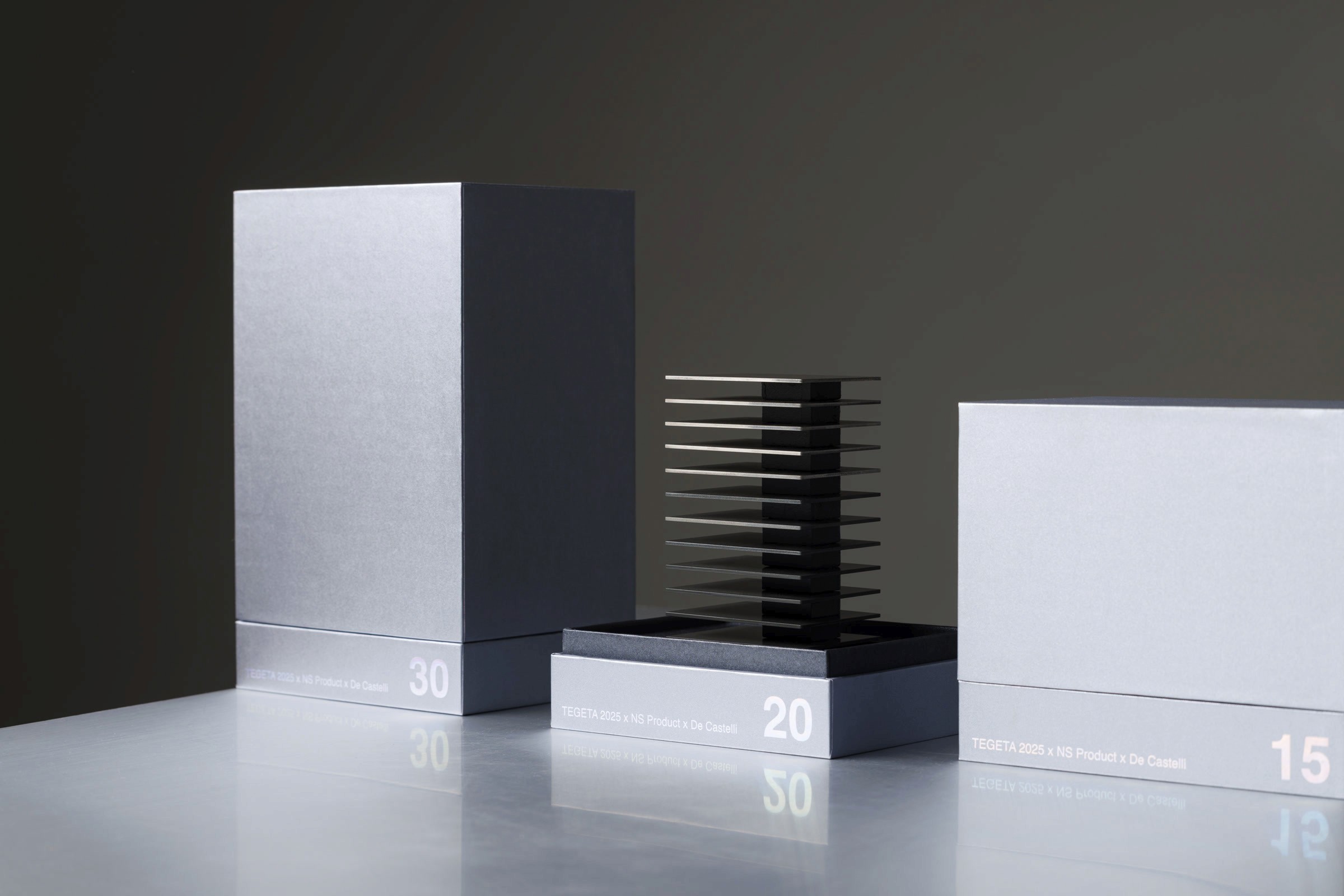
Building on this idea, the object was developed as a scalable system. The same structural logic produces four variations for 15, 20, 25, and 30 years of service, allowing the award to evolve while preserving a consistent architectural identity.
Each variation begins with the same architectural principle. A proportioned base supports the stacked structure above, establishing a consistent framework that adapts to each service milestone.
The object grows one layer at a time. Every new plate records another year of dedication until the individual elements become a unified architectural form.
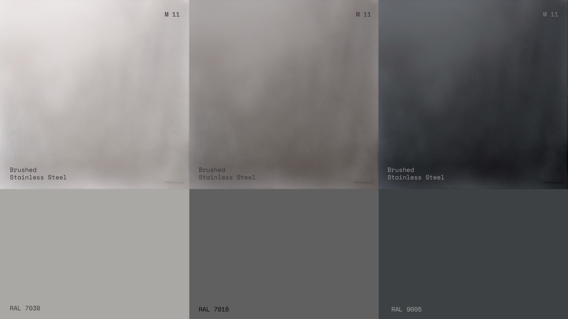
The material continues the narrative of time. Controlled oxidation produces subtle differences in tone and texture, yet every object remains part of the same architectural family.
Simple components come together as a unified object. Light passes between the layers, emphasizing the rhythm of the structure and the precision of its construction.
Together, the four objects form a single architectural family. Their changing proportions reflect different years of dedication, and every variation remains connected through the same structural language.
More than a commemorative object, the award becomes a physical record of time. Its layered form gives permanence to years of dedication without relying on decoration or narrative.
Every plate occupies a precise position within the structure. Small shifts in light and shadow reveal the depth, rhythm, and material quality of the finished object.
Closer inspection reveals the discipline behind the object. Material, proportion, and precise detailing work together to express the concept without unnecessary embellishment.
The complete series reflects three decades of dedication through proportion. A single architectural language connects every object, regardless of its scale.
More than a commemorative object, Thirty Years in Form becomes a lasting record of contribution. Through architecture, material, and proportion, it transforms thirty years of dedication into a tangible expression of collective achievement.
*Client* / Tegeta Holding / *Creative Direction* / Teona Kokhodze / *Design* / NS Product / *Production & Metal Finishing* / De Castelli / *Photography* / Giorgi Mamasakhlisi / *Awards* / *A’ Design Award* - Bronze / *London Design Awards* - Silver
Thirty Years in Form
Objects
Creative Direction
04




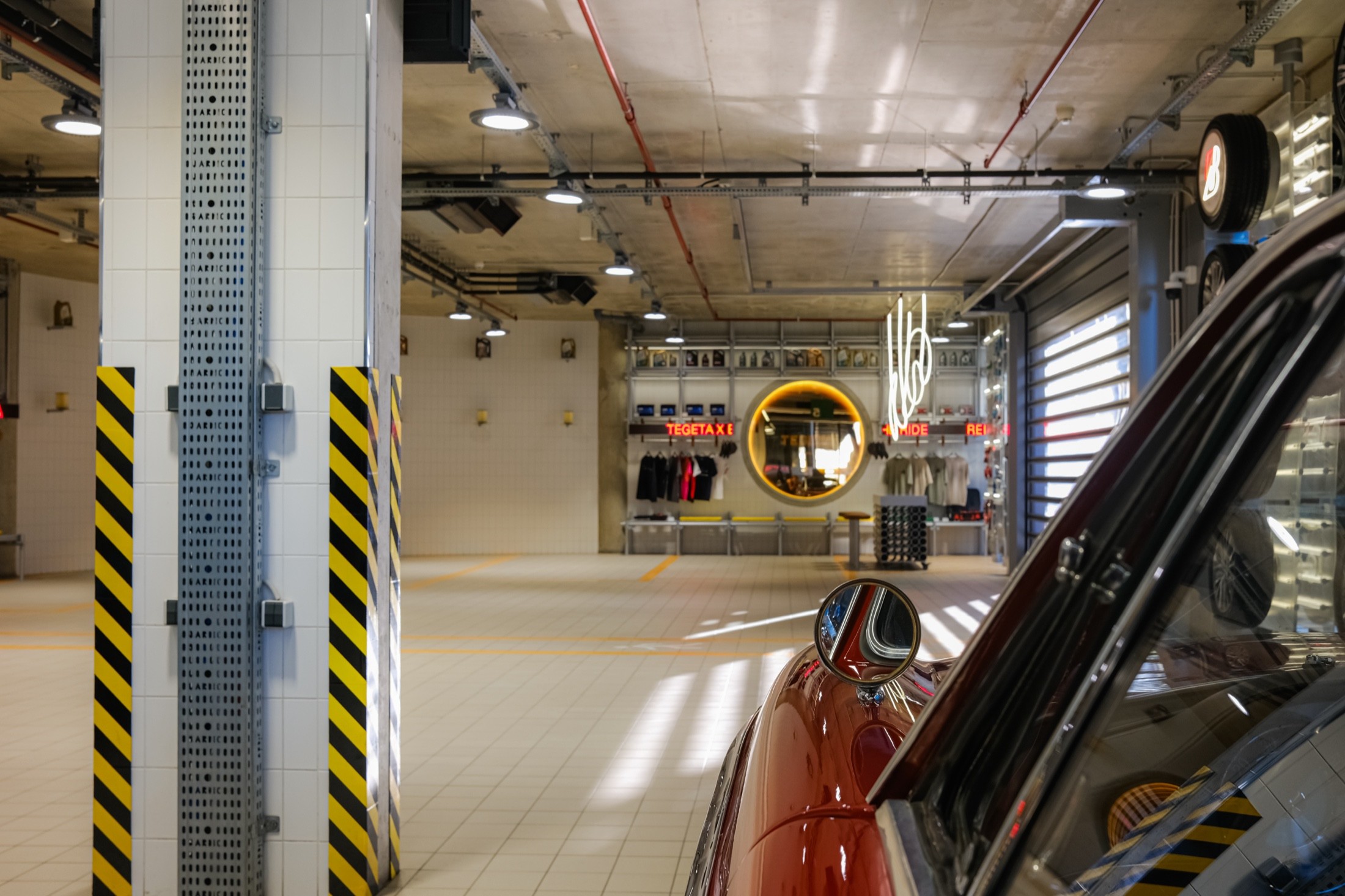
A conventional tire service rarely offers an experience beyond maintenance. Reimagine the Ride transforms the service center into a curated brand environment where architecture, retail, and automotive culture merge into a single spatial journey.
The project reorganizes service, retail, and customer experience into one continuous environment. Developed around a museum concept, every zone becomes part of a carefully choreographed spatial journey.
Retail is embedded within the architecture instead of being treated as an independent destination. Product displays, merchandise, and information are integrated into the customer journey, creating natural moments of discovery throughout the space.
Infinity mirrors establish the project's visual rhythm. Acting as architectural landmarks, they organize circulation, frame key moments, and reinforce the spatial narrative throughout the service environment.
The merchandise extends beyond automotive products. Tegeta-designed collectibles, developed with Georgian artists, position the space as a platform for contemporary design and cultural collaboration rather than retail alone.
Instead of concealing technical operations, the project celebrates them. Exposed equipment, industrial structures, and workshop infrastructure become integral parts of the architectural language, expressing precision through authenticity.
The wheel tower transforms a functional automotive object into a central exhibition feature. Its vertical structure gives the display a sculptural presence while creating a strong visual anchor within the space.
Reimagine the Ride transforms the automotive service center into a flexible platform where service, retail, and cultural programming coexist. Designed to accommodate exhibitions, podcasts, launches, and brand activations, the project extends beyond its operational role to create an engaging and memorable brand experience.
*Client* / Tegeta Holding / *Creative Direction & Concept Development* / Teona Kokhodze / *Design Development & Execution* / Material Editors / *Technical Detailing & Execution* / Ad Solutions / *Poster Design & Graphics* / Tamuna Kontridze / *Photography* / Louisa Chalatashvili / *Awards* / *FRAME Awards 2026* - Honorable Mention / *German Design Awards 2027* - Excellent Architecture - Retail Architecture / * Architecture MasterPrize 2026* - Interior Design - Retail Interior category - Honorable Mention
Reimagine the Ride
Mobility Experience
Brand Experience
05




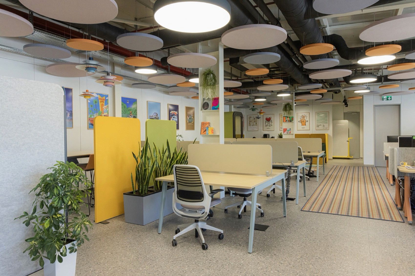
A workplace is shaped as much by behaviour as by architecture. Developed for Tegeta Holding's marketing department, the project translates research into a flexible environment where collaboration, creativity, and focused work coexist within a cohesive spatial system.
The project began before design. Questionnaires, interviews, and workplace observations revealed how employees preferred to work, collaborate, and move through the office, forming the foundation for every spatial decision.
Architectural dividers create rhythm, transparency, and spatial layering throughout the office. Rather than separating departments, they define spaces while maintaining openness, daylight, and visual connection across the workplace.
Shared spaces are distributed throughout the office to encourage informal interaction alongside focused work. Lounge areas, meeting rooms, and circulation zones support everyday collaboration while creating a welcoming and people-centered workplace.
A restrained material palette, natural greenery, and generous daylight create a calm working environment. Architectural dividers introduce rhythm and transparency while defining different zones without interrupting openness.
Modular furniture and adaptable workstations allow the workplace to evolve over time. Flexibility is embedded into the office, supporting changing teams and new ways of working.
The visual language reflects the project's central idea: a workplace shaped around people, where architecture supports communication, flexibility, and everyday experience.
A working environment is most effective when it adapts to the people who use it. Spaces to Work Better redefines the office as an environment shaped by behaviour as much as architecture. Research, flexibility, and spatial clarity come together to create a space that evolves over time.
*Client* / Tegeta Holding / *Concept Development & Workplace Strategy */ Steelcase, Teona Kokhodze / *Architectural Design Team* / Steelcase, Teona Kokhodze / *Interior Design* / Teona Kokhodze, Liza Khazaradze *Project Management* / Nana Beriashvili, Gaga Abuladze / *Construction* / Gravita, Roma Esartia, Avtandil Akhalbedashvili / *Furniture* / Steelcase, Office Technologies / *Photography* / Louisa Chalatashvili
Working Space
Research, Strategy
Workplace Strategy
06




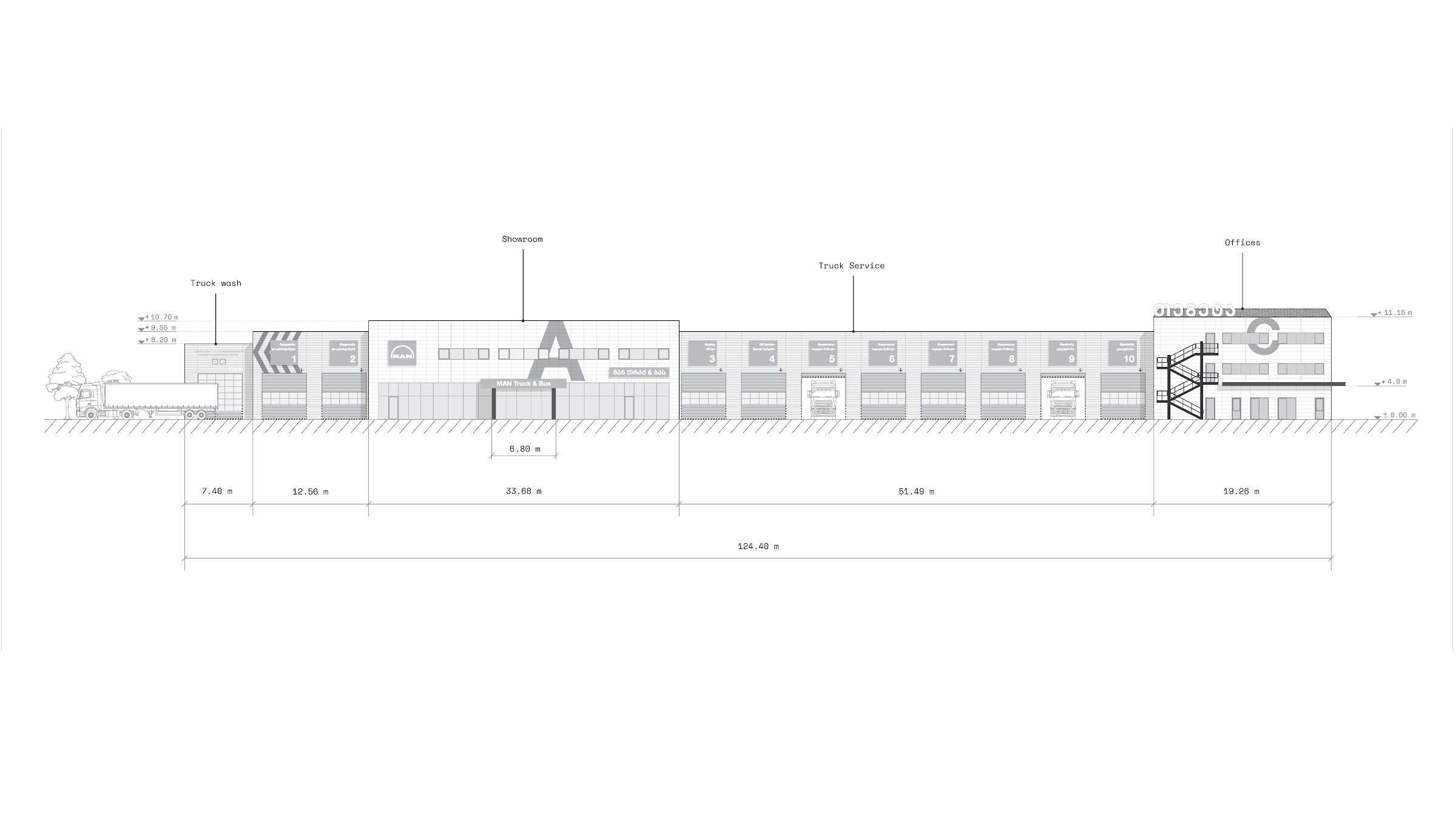
GEZI is a multifunctional automotive campus designed for Tegeta Holding. Bringing together vehicle sales, technical service, logistics, administration, and customer facilities within a single environment, the 42,000 m² campus reimagines industrial infrastructure as a cohesive architectural experience. The design integrates architecture, environmental graphics, customer experience, and wayfinding into a unified system that brings clarity to a highly complex program.
Large-scale service environments are typically designed around operational efficiency, often at the expense of user experience. GEZI integrates orientation, architecture, and customer interaction into a single spatial system. Accommodating multiple brands, workshops, offices, retail spaces, lounges, and public areas, the campus establishes a consistent visual language across diverse functions.
The project was developed as a comprehensive design system, where building identification, circulation, interiors, and customer touchpoints form a continuous spatial experience. Through hierarchy, consistency, and architectural integration, the design reduces complexity, making navigation intuitive, buildings easily identifiable, and technical spaces clear without compromising their industrial character.
The same design principles extend throughout the customer journey. Reception areas, retail spaces, cafés, workshops, and technical facilities share a consistent spatial language tailored to their specific functions. Large glazed interfaces make technical processes visible, giving industrial spaces the same level of design consideration as public areas.
The arrival experience begins with an open reception where customer service, retail, and consultation are brought together within a single environment. MAN's corporate identity is expressed through architecture, integrating branding into the space while maintaining a clean, functional, and welcoming atmosphere.
The reception brings customer service, retail, and consultation together within a single open environment. A restrained material palette, integrated branding, and clear spatial organization express MAN's identity, establishing a welcoming first impression.
Extending the reception, the MAN Shop integrates retail into the overall service environment. A restrained material palette and carefully curated displays highlight merchandise while reinforcing MAN's identity. Positioned within the arrival area, the shop encourages interaction without disrupting the openness of the space.
Dedicated consultation areas support fleet and corporate clients, overlooking the workshop through full-height glazing. The uninterrupted view reinforces trust and emphasizes the precision of the service environment without compromising the privacy of client meetings.
Behind the public areas, the workshop forms the operational core of the building. Its modular organization supports multiple service bays and uninterrupted circulation for technicians, equipment, and heavy vehicles. Structural and mechanical systems remain exposed, expressing the operational logic of the space.
Extending the same campus-wide design principles, Block B serves as the primary customer interface for Tegeta's passenger vehicle service operations. Unlike Block A, it expresses Tegeta's own architectural identity through a flexible interior framework that accommodates multiple brands, unified by clear circulation and a consistent spatial language.
Building identification is integrated into the architecture through large-format typography, color-coded accents, and clear numbering. The system creates intuitive orientation across the campus and distinguishes each operational zone.
Specialized repair facilities require precise technical conditions, from lighting and workflow to equipment integration. Technical performance and architecture operate as a single system to support efficiency, safety, and long-term durability.
The paint booth integrates advanced technical systems with a cohesive architectural design. It ensures optimal conditions for vehicle refinishing by prioritizing precision, safety, and workflow efficiency, while aligning visually with the overall service environment.
Above Block B, the upper floor provides a dedicated hospitality space for international freight drivers during mandatory rest periods and vehicle servicing. A lounge, dining area, quiet workspaces, library, wellness facilities, laundry, changing rooms, and an outdoor terrace support wellbeing and everyday routines, introducing a domestic atmosphere that contrasts with the industrial environment below.
Completing the campus, Block C serves as Tegeta's administrative headquarters. Corporate offices, meeting rooms, and public reception areas are organized within a unified workplace, with the ground floor forming the primary point of arrival for employees, partners, and visitors.
The reception forms the public face of the headquarters, bringing together waiting areas, exhibition displays, and Tegeta Collectibles within a single open plan. The space introduces visitors to Tegeta's identity through architecture from the moment they arrive.
One of the defining elements of the arrival space is a curated exhibition wall documenting the company's evolution through archival photographs, historical milestones, and selected projects.
Alongside the exhibition, the reception features Tegeta Collectibles, a curated collection of apparel and lifestyle products designed to express the company's identity through physical items.
Beyond the public reception, shared spaces are distributed throughout the office to support collaboration, focused work, and informal interaction. Together, they shape a flexible workplace that adapts to different ways of working.
The design principles established in the shared spaces continue into the open office. Workstations are organized to encourage collaboration, complemented by meeting rooms and breakout areas for focused work. Natural light, integrated planting, and a restrained material palette create a balanced workplace.
Across the 42,000 m² campus, a comprehensive signage and wayfinding system connects roadside navigation, on-site pylons, building identification and façade graphics. Developed as a unified architectural language, it guides visitors intuitively across the different buildings, services and shared spaces.
Selected pages from the GEZI Signage & Wayfinding Guidelines, 2026.
*Client* / Tegeta Holding / *Location* / Tbilisi Bypass Rd, Georgia / *Project Type* / Automotive Campus / *Year* / 2025 / *Creative Direction* / Teona Kokhodze / *Project Coordination* / Teona Kokhodze, Sopo Kacharava, Sopo Maisuradze / *Environmental Graphics* / Zura Bakhutashvili, Salome Abzianidze / *Interior Design* / Teona Kokhodze, Elene Ratishvili / *Façade Design* / Ruska Abesadze / *Architecture* / Roma Esartia, Andrea Petrov / *Construction* / Gravita / *Wayfinding Design* / Büro für Gestaltung Frank Abele / *Photography* / Giorgi Mamasakhlisi, Mariam Nakani
GEZI demonstrates how architecture, branding, and customer experience can transform automotive infrastructure into a cohesive environment defined by clarity, identity, and human experience.
The main lounge reimagines the traditional waiting area as a place for dining, work, and relaxation. Sairme Bakery, established at Sairme Resort in 2012, reinforces the hospitality concept by introducing a familiar local brand that gives the space the character of a contemporary café.
Integrated Mobility Campus
Automotive Campus
Wayfinding, Spatial
07



If women drive industries, corporations, economies, parliaments, and households, why on earth would we think they can't drive a car?
Despite the countless ways women shape society, driving is still widely perceived as a man's role in Georgia. Woman Drives challenged this cultural stereotype by redefining what it means to drive, celebrating twenty-seven women whose work moves the country forward every day.
There are no actors in these portraits. Every woman appears in the environment where she quietly changes everyday life, allowing authenticity to become the campaign's strongest argument.
Filmed across eight regions and eleven cities in just two days, the production captured twenty-seven workplaces through a restrained visual language, giving every protagonist her own distinct atmosphere.
*Featured Women* / *Truck Driver* - Megi Mekerishvili / *DJ* - Elene Sabiashvili / *Photographer* - Natela Grigalashvili / *Goldsmith* - Ina Natsvlishvili / *Off-roader and her Co-pilot* - Maia Goshadze, Mariam Khositashvili / *Conductor* - Keti Kartvelishvili / *Head of Sukhishvili Academy* - Ninuka Sharashidze / *Shepherd* - Tsiuri Gigauri / *Ranger* - Eka Bachilava / *Miner* - Nato Abesadze / *Researcher* - Nata Bukia / *Publishers* - Ana Kiasashvili, Mariam Kvitsiani / *Mechanic* - Lika Maisuradze / *Chef* - Nino Lashkhi / *Chief Operating Officer* - Irina Kitiashvili / *Occupational Safety Manager* - Tika Gagnidze / *Surgeon* - Teona Danelia / *Emigrant* - Keti Mumladze / *Head of Video Production* - Maia Gurabanidze / *Script Author* - Diana Anfimiadi / *Voiceover* by a 78-year-old doctor from Borjomi - Zeinab Lekveishvili
*Client* / Tegeta Holding / *Chief Marketing Officer* - Elenka Kokhreidze / *Chief Strategic Communications Officer* - Tatia Khorbaladze / *Senior Art Director* - Teona Kokhodze // *Creative Studio* / JOYBOY / *Creative Director* - Giorgi Kvitatiani / *Executive Creative Director* - Lasha D. Kotori / *Senior Art Director* - Luka Ivanidze / *Senior Designer, Typography* - Giorgi Khardziani / *Art Director* - Nutsa Kakulia / *Copywriter* - Sopo Lomineishvili / *Motion Designer* - Ako Rekhviashvili / *Illustrators* - Mariam Kotishadze, Ana Melikjaniani / *Account Manager* - Nino Kristesiashvili / *Creative Team* - Ani Melikjaniani, Shio Peikrishvili, Mariam Tepnadze, Mariam Kotishadze, Mariam Razadze // *Production Company* / INDUSTRIA / *Director* - Giorgi Meshveliani / *Director of Photography* - Nika Kachibaia / *2nd Unit Operator* - Tato Kotetishvili / *Head of Production* - Maia Gurabanidze / *Executive Producer* - Sandro Gabilaia / *Producer* - Keti Ka / *1st Assistant Director* - Gvantsa Zhuzunashvili / *Technical Director* - Guram Mosikashvili / *Production Coordinators* - Mariam Romelashvili, Irinola Tlashadze / *Art Director* - Anka Gabunia / *Location Manager* - Nikusha Nemsadze / *Production Assistant* - Salome Alimbarashvili / *Transport Manager* - Davit Peradze / *Makeup* - Veriko Bedeladze / *Financial Director* - Maka Labadze / *Financial Coordinator* - Teko Gurabanidze / *Photographers* - Giorgi Nikolaishvili, Irinola Tlashadze, Niko Agladze // *Camera & Lighting Gaffer* - Acho Samkharadze / *Lighting* - Giorgi Samkharadze / *Focus & Camera* - Ina Nerserian // *2nd Unit Gaffer* / Giorgi Chopliani / *Camera* - Giorgi Pkhaladze, Nika Sachaleli // *Drivers*- Gia Chalauri, Avto Ugulava, Gia Tetradze, Giorgi Zakaidze // *Music* - Araushavs – "Oh Margarita" / *Original Music Author* - Tamar Ishkhneli // *Post-Production* / *Post-Production Producer* - Ekaterine Davitashvili / *Editor* - Tazo Jobava / *Sound Design* - Uzupo / *Colorist* - Mindia Inasaridze / *Special Thanks* - Lana Chologauri, Tea Tiginashvili, and Dato Maisuradze // *Awards* / *KIAF* - Gold ×1 /*KIAF* - Silver ×5 / *KIAF* - Bronze ×5 / * AD BLACK SEA 2026* - Bronze
Woman Drives
Campaign, Storytelling
Driving Change
08


